


Politics, Elections and Geography


Politics, Elections and Geography
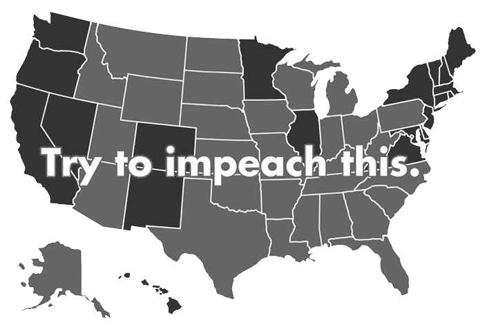
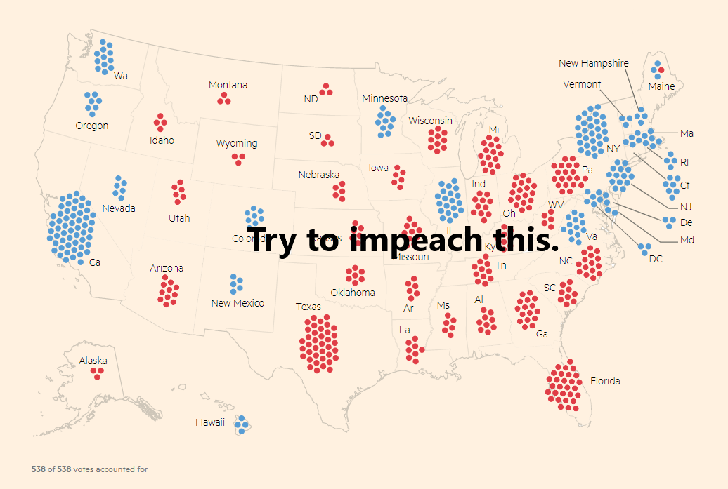
The report was on one of my pet peeves - how maps are misused to present a particular perspective. The report described an investigation into the space of visually communicating political election results. It focused on how, by incorporating geographical data, the presentation of election outcomes is sometimes distorted. These misrepresentations may be either unintended or deliberate. The picture below is a pun - the slogan doesn't quite work when the electoral college vote is more accurately reflected in the map.

Feedback
"The report opens up with a highly detailed but maybe slightly long introduction to the election systems. This could have been shortened to open up more space for reflection and analysis of the visualisations. Positive that you are transparent about your research process and present it clearly -- this is rigorous. Although a reflection on why the query results are the most representative of these two countries' mapping styles could have been a good addition.
You are walking us through a tour of maps and have done great research on how politicians (mis)use maps and how journalists are trying to deal with these issues. This is a powerful story and you build the narrative quite well and your climax with Figure-8 is an excellent closing to the report!"